Now that we’re more than a week removed from the Minnesota Timbewolves’ “new” jersey and logo “unveiling,” it’s proper time for a comprehensive look at Wolves jersey history and where the new threads stand.
No one asked for 4,000+ words on the Wolves’ jersey history, and that’s precisely what I have for you here. In honor of the Wolves announcing their new primary triptych of unis, let’s talk about every single uni in franchise history and talk shit about most of them.
Let’s go over some ground rules first:
- This list is subjective and not meant to offend. If I bash your favorite Wolves jersey, don’t crash out like a Wolves fan on social media who’s just been reminded that Julius Randle exists and remember that it’s just my opinion and we’re having fun.
- This list is also objective and correct. If I bash your favorite Wolves jersey and you get offended it’s because you have terrible taste and you’re wrong.
- Ranking things is stupid and I know it’s stupid. I hate that I’m here. This isn’t so much a rule as it is a general feeling, but nevertheless, important to your understanding of how I’ve arrived at such conclusions.
- Each jersey must have been worn in an official NBA regular season game to be counted here. No Summer League, no G League, no 2007 European Tour with the weird red trim where the trees usually were. I don’t care how much Sebastian Telfair ate in those jerseys in Istanbul. That game didn’t count, Steve, and you wouldn’t have said ‘he ate’ in 2007, either. Grow up.
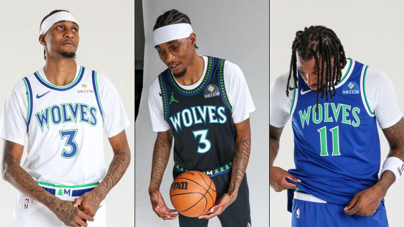
- The three brand new jerseys are not ranked here and for good reason. We haven’t seen them in game-action yet, so technically by the rules I’m making up — whilst 1-2 G&T’s deep and watching World Cup After Hours while writing this — they’re ineligible. I do love them, though, so you can place the whole set at or near the top and let’s just all reserve the right to talk more about them later. I do feel very satisfied with what I’ve seen, though, and truly hope we’re done with new jerseys for a very, very long time, with the exception of the state of New Jersey. Minnesota thanks you profoundly for producing Olivia Miles.
- The jerseys are ranked from worst to first. I count 26 eligible jerseys in Wolves history, so we start with dead last and work our way to the top.
- Alright let’s remember some dyes!!! (See what I did there?)
26 | 25 | 24 | 23 | 22 | 21 | 20 | 19 | 18 | 17 | 16 | 15 | 14 | 13 | 12 | 11 | 10 | 9 | 8 | 7 | 6 | 5 | 4 | 3 | 2 | 1
26. The Wannabe Seattle Seahawks Abominations
Statement Edition: 2017-2022

I know there’s a subset of fans who liked these, but the wannabe Seahawks joints were an absolute abomination and the worst thing that’s ever happened to the franchise. I said it. I found the whole set of jerseys from the 2017 re-brand to be one massive bust, but I didn’t hate any of them with every part of me like I did the neon greens.
Because I am a responsible author, I will always inform the reader when there’s a chance of my own inherent biases showing up in my work. With this in mind I must say that as an Oregon State grad, my deep hatred for all things Oregon Ducks already makes it impossible for me to appreciate anything highlighter coded. HOWEVER, not only was the neon phase of sports jerseys one of the dumber trends in all of sports uniform history, the Wolves were 10 years too late to the trend anyways.
Everything about these sucked and they were the rare exception of an awful jersey that looked worse in person. That is almost impossible to do! I’d get to a game and they’d be wearing them and I’d just want to go home. When I think about them now I get mad at Jimmy Butler all over again.
The Jumpman patch on this jersey in its last few seasons made them 1% better, but all that did was raise their overall value to (checks notes) 1%.
25. Black Sleeves
Alternate: 2013-2017

Fewer NBA trends landed with more of a thud than the sleeved jerseys of the mid-teens. These not being in last place further cements my deep hatred for the wannabe Seahawks joints.
I didn’t mind the regular black alternates that these were based off and those show up much further down the list, and I don’t understand why the side piping changed from that version so drastically.
Compared to the other sleeved jerseys of that era, these were far from the worst, but not enough to rise any higher than barely above the worst jerseys in franchise history for me.
Their one redeeming quality: watching a game with my dad during one of those seasons he said, “Nikola Pekovic looks like he should have a pack of cigarettes rolled under one of the sleeves like Snake in The Simpsons” and that imagery makes me laugh. That’s it. That’s the redeeming quality.
24. Immediate Post-KG Away
Away: 2008-2010

Losing Kevin Garnett to Boston after 12 seasons in Minnesota hurt, but it didn’t hurt nearly as much as watching the immediate post-Garnett era Wolves in these rags (they did wear the original trees for one season without KG).
This jersey marked the organization’s first attempt at having anything other than ‘Wolves’ or ‘Timberwolves’ on the front of the jersey, and set the tone for that to be a complete and utter struggle that’s lasted until today.
What was worse, the jerseys themselves or having to watch Oleksiy Pecherov start in them? You know what, don’t answer that.
These ones also remind me of Nathan Jawai, so, there’s that.
23. Immediate Post-KG Home
Home: 2008-2010

These ones actually looked a bit better in person than their away counterparts and I was tempted to put them higher. I still have an Al Jefferson one of these, which I wear to yoga sometimes. Cool story, Hansel. ‘Wolves’ is just a handsome set of six letters that it’s hard to mess up and yet…
All the problems of the away jerseys are present here with just a little less clutter. The weird triangle at the bottom of the neck, the psychedelic tree piping at the top of the neck and along the side, it all reeks of an organization rebranding for the sake of rebranding.
I’ll still affectionately hang onto my Big Al jersey for as long as I have jerseys in my home, but I can’t lie and say either of these possess a single redeeming quality.
This does conclude our ‘holy shit these were awful’ section of Wolves jersey history. Everything from now on did at least one thing right.
22. Too Many Colors
City Edition: 2022-23

Okay maybe I spoke too soon about moving on from the awful. This was a baffling choice for so many reasons and the fact that it replaced a truly fantastic City Edition from the year prior (more on that one later) makes it even worse.
The intent of these jerseys was to celebrate Minnesota’s vibrant artistic community, which is a very nice starting point. Unfortunately, the result falls well short of anything you’ll find in the vintage booths at Art-A-Whirl. An interesting note of these jerseys is the colorful pattern above the script was printed differently each time so each player on the court was technically wearing a different jersey.
From the official release: “The Timberwolves are the first team and only team to wear a uniform that has fabric patterns which are intentionally not-uniform in that no two will ever be produced identically.”
The history of Timberwolves basketball is littered with dubious achievements. The history they made with this joint is definitely one of them.
Okay, now I think we can say we’re in the ‘not good, but not awful’ territory.
21. The Yung Gravy Lake Days
City Edition: 2023-24

I don’t think a jersey has ever embodied the Ryan Reynolds ‘…but why?’ meme from Harold & Kumar Go To White Castle more than these. If the walls of the conference room where these were cooked up could talk, imagine the things they would say:
‘You know how we have lakes in Minnesota? Well, what if the jersey looked like a lake?!’
‘Interesting. How big would the font be?’
‘Real fucking small!’
I’d have several questions for whatever marketing agency genius they dragged in for these. To which I’m sure they’d respond with ‘Don’t worry about that part, Terry, we’re getting Yung Gravy to introduce them!’
Literally, why? Why? Why?! WHY?!? Just so much why? But hey, these were at least adjacent to the Naz Reid beach towels, and that counts for something.
20. The Yung Gravy Lake Day Remixes
City Edition: 2024-25

Everything I said above stands, but the inverse of the lake jerseys for the second season is a better jersey with less going on.
I don’t have too much else to say about them and the shorts that went with them were pretty decent.
If you think I’ve been an insufferable Negative Nancy for the past 1,100 words then bear with me.
Only a few more uninspired threads to go until we get to the good stuff!
19. The North Star Joints
City Edition: 2020-21

I just don’t like Wolves jerseys with literally zero blue in them. It’s the franchise’s main color. It’s essential. It’s why I’m not super enthusiastic about the Vikings ‘Winter Warrior’ uniform set because the charge there seemed to be to design a Vikings uniform with as little purple as possible.
There are some things to like about this one, though, and I think I like it more today than I did at the time. The star pattern along the side is cool, and I actually do kind of like the four-pointed north star sitting smack dab in the middle of Ricky Rubio’s sternum.
The four-letter script of ‘MINN’ just looks so odd. It’s possible I’m picking nits here, but it’s another representation of the challenge of putting location representation on the front of the jersey instead of team name representation in Minnesota. I’ve been thinking about it (clearly, for way too long now) and my thought is this is a challenge for all teams that are named for states rather than cities. All the best Utah jerseys say ‘Jazz’ rather than ‘Utah.’ The Reggie Miller era Pacers away jerseys always said, ‘Indiana’ and those were dope, so it is possible. It’s just not easy and the Wolves have yet to find one that truly works.
As mentioned in how I feel about the current set above, I hope they’re done trying (the Wolves at least, the Lynx ‘Explorer’ unis that say ‘Minnesota’ are fine because they’re not trying to do too much).
18. Ricky Rubio Era Away Blues
Away: 2010-2017

I really wanted to put these ahead of the most recent away threads the Wolves just got rid of, but I couldn’t pull the trigger.
These are fine, boring, but fine.
The green in the immediate post-KG era uniforms was dispatched horribly, but the complete lack of green always felt like something was missing.
As someone who will ride or die for the trees, at least an element of green is important, especially in one of the two main jerseys.
17. Most Recent Away Threads
Icon Edition: 2017-2026
Okay, let’s address the elephant in the room. Did anyone actually like these when they came out? I covered some of the elements in our last place finisher for this list, but there’s so many baffling decisions here.
The font is devoid of any personality. What’s with the multiple shades of blue? What’s with the weird bar above the script?
There’s not much separating the homes and the aways here, but the royal blue of the shoulder straps on a mostly navy blue jersey is just not a pleasant clash. It’s less pronounced on the home whites.
May these be put in the same box where they’re hiding the 2003-04 Midwest Division Championship Banner never to be seen again.
16. The I Feel Nothings
City Edition: 2017-18

The only explanation for these is that someone was paid handsomely to design the most boring jersey in City Edition history and came up with this little juiceless number. As my title for them notes, I feel nothing when I look at these jerseys. In fact, I feel less than nothing.
If any semblance of a color scheme had been applied to these they’d be way better than the main set from the 2017 rebrand. There’s no weird bar. There are no shoulder straps. But part of the reason none of that stuff is there is because there’s NOTHING! Color is cool, man. Fucking Pleasantville ass uniforms.
These do have the very important redeeming quality of being the jerseys worn by the Wolves in the ‘win-and-in’ 2018 season finale against Nikola Jokic and the Denver Nuggets. The true birth of the current rendition of the Minnesota/Denver rivalry.
Technically, these jerseys helped launch the play-in tournament and I’ll remember them every time I watch the ninth-best team in the Western Conference play the 10th-best team in the Western Conference as much if not more than I remember Patrick Beverley.
15. Most Recent Home Threads
Association Edition: 2017-2026

In a word: Meh.
They’ve always been just straight up meh.
I refuse to spend more breath or time on them than that.
Moving on…
14. Ricky Rubio Era Home Whites
Home: 2010-2017

It gets a hit for the same lack of green as the away unis, but because they have the more woodsman/northwoods feel, they come in a slot higher than the meh home whites the Wolves just got rid of.
Could you say that makes them more ‘meh-morable?’
Ok, I’ll stop.
13. The Minnesota Muskies
Alternate: 2011-12

Me being a sentimental nostalgia-prone millennial has me rating these higher than they probably should be. The jerseys themselves were great, but there was some weird piping on the side of the shorts that wasn’t on the tops, which always looked kinda weird.
These were only worn during the 2011-12 season. A season I’ll always remember fondly since it was Ricky’s rookie year and absolutely electric until he tore his ACL. The Wolves were in playoff position during the lock-out shortened season and watching Ricky felt like the franchise caught lightning in a bottle. Watching the Wolves that season was the most fun it had been in nearly a decade and some big wins were had in the Muskies threads.
I also love nostalgia. Sue me.
12. Merry Christmas
Christmas Day: 2016

The first Christmas Day game in franchise history came with its very own jersey, which the Wolves wore all of one time, doing so in Oklahoma City where they lost to the Thunder in a way-too-early 2025 Western Conference Finals Preview. It might have been another Wolves loss during a fairly disappointing season, but hey, they didn’t let Russell Westbrook get a triple-double during the heyday of Russ eating triple-doubles for breakfast, so that’s something.
It’s not a remarkable jersey (I promise I will start saying nice things by the end of this), but could have been so good! It just needed to be blue instead of black — or black with some blue and green accents. With just that shade of green backdropped by all black, it doesn’t even look like a Wolves jersey if you squint.
Make that thing blue with just a wee bit of white threading in the letters, ooooooh boy, would have been clutch. But, alas, it still was a Wolves jersey and it was also the first Christmas after the 2016 election. None of us could have nice things.
11. The Airport Joints
City Edition: 2019-2020

As a pure jersey, this one actually had a lot more going for it than a lot of the other attempts through franchise history. It just never felt like a Wolves jersey, and the organization/Nike also comically thought they could use a trio of letters that only ever refer to our city’s airport code and is never used in any other social circumstance.
Can you imagine if anyone ever uttered the phrase, ‘Yeah we’ll catch ya at the Wolves game when we’re down in MSP!’??? Gross. You’d excommunicate that person from your life immediately.
I love baby blue and white, but sadly, those aren’t this team’s colors and they never will be no matter how hard you try. This jersey got caught in the tough spot of the organization clearly wanting to do something that honors the Minneapolis Lakers heritage (whether they admit it or not), but also being scared shitless to ever brand something exclusively as ‘Minneapolis.’ No teams in this market ever do and it’s annoying. I get they’re not named for Minneapolis, but the Minneapolis Lakers were a major part of the basketball fabric of our city and our state. You obviously can’t put ‘Lakers’ on a jersey, but you sure as shit can put ‘Minneapolis’ on one lousy city edition.
Anyways as stated above, don’t make a Minneapolis jersey now because I’m done with new jerseys. This is a prime example of when trying to please everybody pleases nobody. The introduction of these with Mayors Frey and Carter was also embarrassingly cheesy.
10. The Statements That Don’t Totally Suck!
Statement Edition: 2022-2026

Ugh, thank god these replaced the Seahawks before I had to take matters into … well, before something bad happened. Many small details make this by far the best of any of the main three sets we’ve been watching the Wolves in the last few years.
For one, the bar above the script is thinner. And since the shade of the base of the jersey is the same throughout, the bar looks way less stupid. The jersey is gray and it’s green. Not very ambitious, but not very ambitious also means not very dumb. Sometimes less is more.
I’m also a fan of the script reading the full ‘Timberwolves’ team name as opposed to just ‘Wolves,’ to differentiate it from the two mains. The bottom tips of the ‘M’ and the ‘V’ dipping below the font line is interpreted by this sicko as a subtle nod to the font on the KG-era trees. It’s also a plus that the Jumpman logo is nice and clean and not slapped over multiple colors. It’s easy to see it’s sponsored by Jordan, which is always a good thing. You’d think Nike would have also always thought that was a good thing.
9. Ricky Rubio Era All-Blacks
Alternate: 2010-2013

Every time I see these jerseys I see Kevin Love draining that three at the buzzer to beat the Clippers.
Ohhhhhhh, so long, Lob City!!!!
Again, a little bit of green in the right places and this could have been an all-timer. It still ends up being a clear favorite in an underwhelming era.
These were the cleanest of the three, making it a real shame that they were the ones they had to mutilate by adding those heinous sleeves to it.
8. The Return of the Trees
City Edition: 2021-22

The theme for the 2021-22 City Editions across the league was ‘Remix the Game,’ combining as many different juxtapositions as we possibly can into one short-set. Like many examples in jersey history, this one was real close to being perfect — like literally almost there — and then they just kept doing more stuff to it.
Still, lots of redeeming qualities with this one. The Wolves returned to the playoffs in these and beat Memphis in Memphis in Game 1 in these. Anthony Edwards’ first playoff game. For tree huggers like yours truly, the return of any semblance of the trees was chicken soup for the soul.
The front of the jersey is phenomenal. The combination of the franchise’s original blue and green colorway is what everyone has always wanted. Putting that colorway on the KG-era font with the tree-trimmed lining, fucking chef’s kiss. So why god why does the jersey shift to the modern dark ass blue for the whole back of the jersey?! That’s not how throwbacks work! Remember that scene in Office Space when Samir asks Michael why he doesn’t just go by Mike given his intense hatred for Michael Bolton and Michael responds with, ‘No way! Why should I change? He’s the one who sucks!’ (I feel this sentiment about something on an almost daily basis).
Nike, my brother in Christ, why is the modern era here? He’s the one who sucks!
Deep breath, Terry. Okay. Still, nearly flawless. Hard emphasis on ‘nearly.’
7. Prince Purples
City Edition: 2018-19, 2025-26

I do love these jerseys and can happily admit loving Prince makes me love them more. Few teams throughout the league have a better jersey inspired by a local legend who was also a fan of the team.
They might be a bit busy, but that’s perfectly fine for a specialty jersey.
On that note, I do think the Wolves wear them too often. There should only be one Prince night a year and they should bust out all the stops for it. Play Prince music and Prince music only. Play a two-second sound bite of Prince screaming “KISS!” every time the opposing team shoots a free throw. Have a dance party on the floor after the game. Fuck it, have a dance party on the floor during the game. Do it all, but do it once. I love Prince as much as the next guy, but we don’t need nine Prince nights.
6. Prince Whites
Earned Edition: 2018-19

The white Prince’s are a cleaner look and more successful overall jersey to me.
However, I do think only the purples listed before this should be worn from here on out.
Clean and simple are not necessary attributes of a specialty jersey.
Ok, let’s move on to the top five!
5. White Trees
Home: 1996-2008

‘I am still searching for the forest through the trees on the Timberwolves jerseys,’ is a great title of a hypothetical Wolves-themed self-help book.
And it may or may not be a sentence I’ve uttered in therapy before.
These were the home whites for Stephon Marbury’s rookie season and the first home game in franchise history.
Minneapolis native RL in the R&B group ‘Next,’ wore a white trees Marbury jersey in the ‘Too Close’ music video, which was easily one of the top five moments in franchise history before Anthony Edwards got here.
4. Blue Trees
Away: 1996-2008

So much love has been shown to the black trees jersey in the last few years that it feels like people have forgotten how hard the blue ones went as well.
A blue Stephon Marbury jersey was the first jersey I’ve ever owned and helped teach me the very encouraging truth that ‘yeah, kid, you might feel heartbroken right now, but I can assure you as long as you keep showing up it will also get worse.’
Insert the Homer Simpson ‘worst day of your life so far,’ meme here.
They still land at second place overall in the original trees trio, but I wish we would have seen these brought back properly once or twice since they went away.
3. Black Trees
Alternate/Classic Edition: 1996-2008/2018-19/2025-26

As the first alternate jersey in franchise history, the black trees were a historic success.
They made their debut in 1997 at a time when jerseys and logos around the league were going fucking nuts. The Pistons’ simple and clean Detroit Basketball turned into a flaming mechanical horse. Houston’s Micky D’s colorway roundlet turned into a rocket ship with teeth (also on fire).
Even the 2025 renditions of these are still very much of a moment in time, but I will always appreciate that as the league was losing its goddamned mind with various rebrands, Minnesota simply put a wolf in a forest and dressed themselves in one of the silkiest alternate sets of all time.
The black jerseys they’re being replaced with are cool, but I am of the belief that they didn’t need to change a damn thing.
2. Old Shep Whites
Home: 1989-1996; Classic Edition: 2023-24

These are 10/10.
Crispy, icy, clean home whites.
No notes and I’m so glad it’s back.
The runners-up. Not up for debate.
Now onto No. 1…
1. Old Shep Blues
Away: 1989-1996

Long live the Eastbay Funk Dunk!
The primary identity and I’m so glad it’s back.
These are the champions. The best jersey the Wolves have ever had.
Really not up for debate.